Intranet Dashboard
I was the UX Designer for a small agile team where I created low-fidelity wireframes based on previously conducted research and creating sketches with the client. I also helped familiarize the team with a user-centric approach to design by hosting several design workshops to gain better insight to how each type of user uses their intranet site.
GATHERING OUR DATA
My team hosted a design thinking workshop with representatives from each department to find out the types of employees that would be using the site daily. We wanted to discover an employee's daily, weekly, and monthly tasks and how they accomplished them through the intranet. We did a rose-thorn-bud exercise where each participant wrote down the positives, negatives, and wishes of what they want from the new design.
The results of the workshop found that employees wanted ease of access to many HR/third-party services that currently led to landing page abandonment. They also wanted more visibility to community and news events from the business since majority felt like they were being disconnected with the company. They were missing out on events and company meetings because they weren't aware of them happening. With that data, we began to prioritize the type of widgets that needed to be designed and how they were organized using affinity clustering.
"As an employee, I want a clean and meaningful dashboard that helps me manage tasks
and would keep me updated so I can stay organized
and reference it daily."
DESIGNING THE SOLUTION
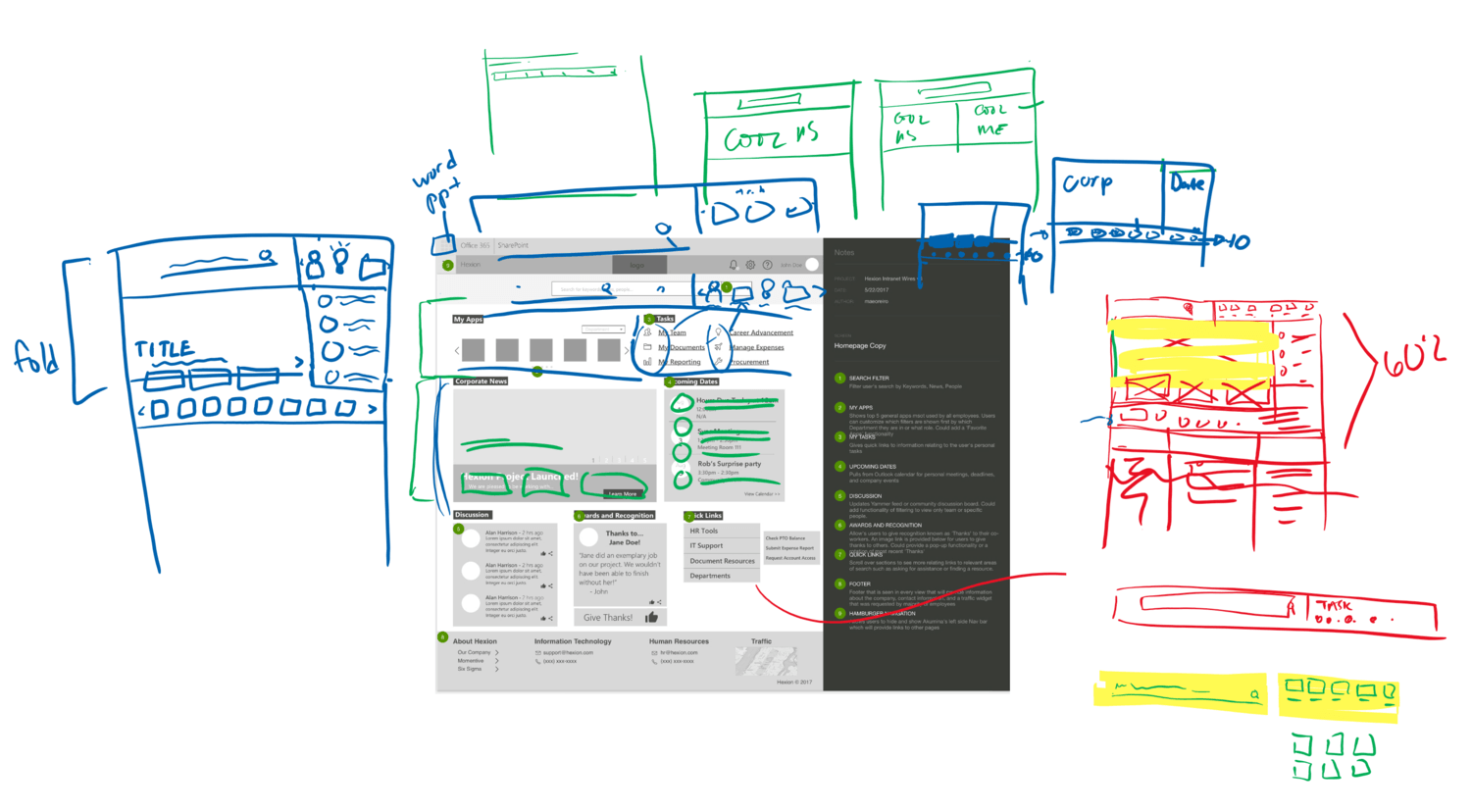
I started my design process by doing sketches on a live whiteboard during team meetings to give them an idea of how I wanted to layout the pages. The widgets were placed with help from the thoughts gathered at the design thinking workshop we conducted and came to the conclusion that we wanted a mix of recent company-related news and maintaining tasks for the homepage.
The image shown is from a whiteboard feedback session I did with my team after presenting my initial low-fidelity wireframe to figure out the content layout and how we can keep the most important information above the page fold.
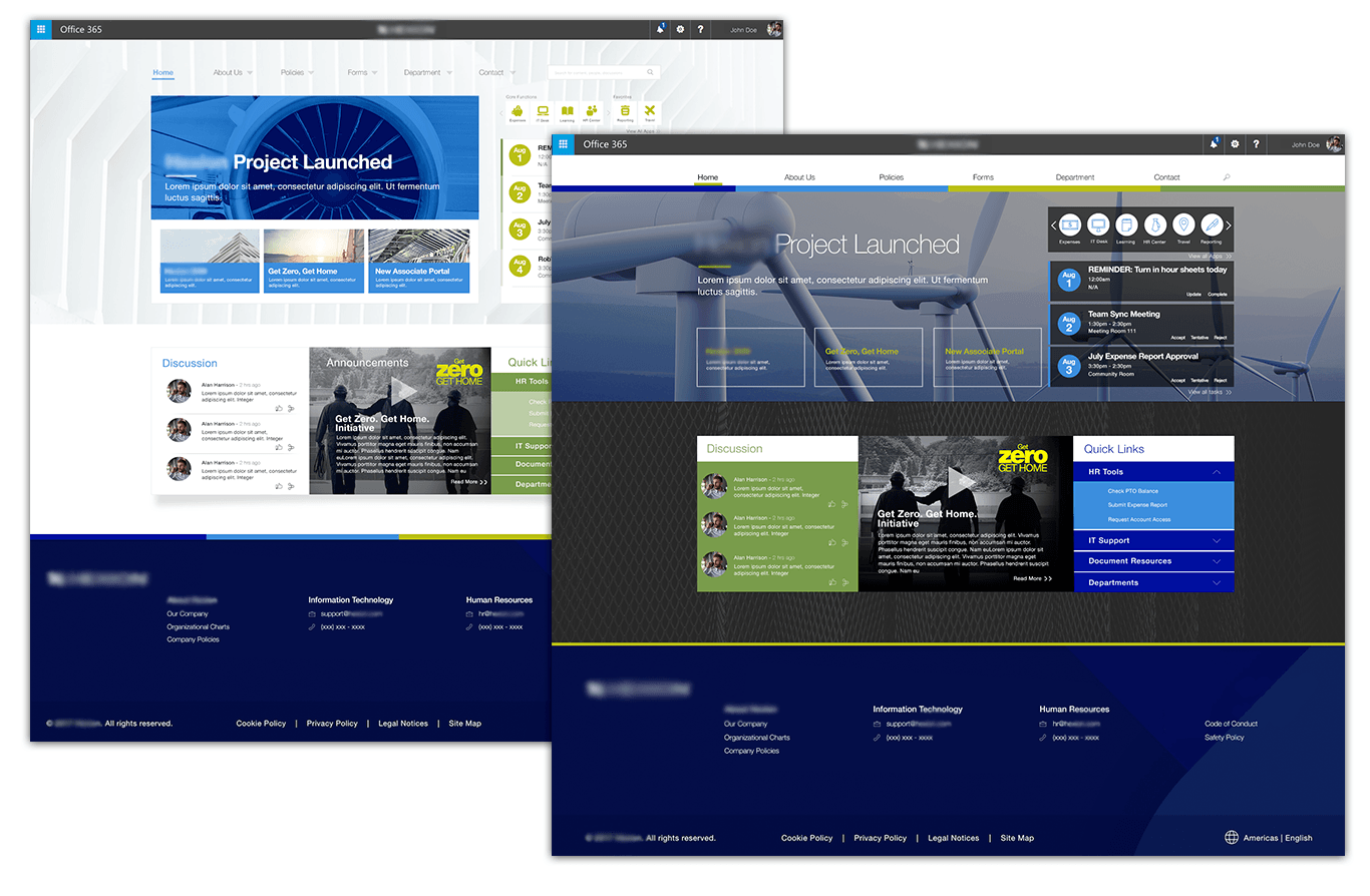
Throughout the project, I worked on the several areas of the new portal, but our main focus was towards the homepage. After several wireframe iterations, I was able to conclude into two designs that I presented to the client for AB testing and feedback sessions. These decisions later went into the creation of the final design.
FINAL THOUGHTS
This was one of my first projects where I really had to think outside the guidelines that were provided to me. Since this was the first time where I was the only UX/Visual Designer for majority of the project, I was given a lot of creative freedom to make suggestions on how I perceived the user would navigate through the portal to find what they are looking for. During my live feedback sessions, I made sure to ask the right questions towards my team and the client on their expectations of the design.
If I had more time, I would have wanted to conduct more usability testing to address pain points with some of the other wireframes I had created since our main focus was towards the homepage portal. I was also unable to create a clickable prototype due to time restraints, but I would have liked to create one to demonstrate the types of interactions. I am happy with the final result and I feel that I was able to condense a large amount of data into what the user needs as their main source of information.


