Field Technician Mobile App
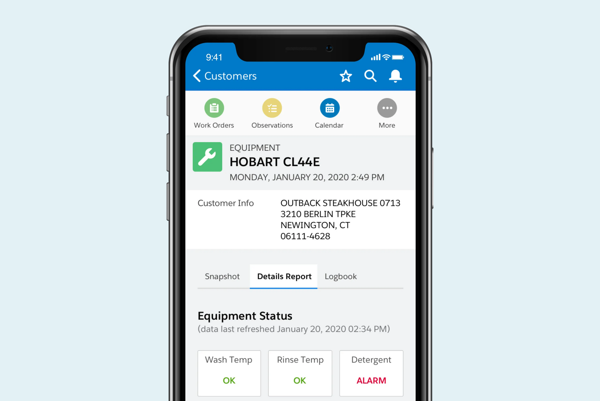
I designed a mobile application experience for field technicians to perform work orders and daily tasks while traveling between their client sites. Collaborating with cross functional teams, I created low-fi and high-fi mockups that I presented to stakeholders to help envision their new mobile workflow.
DEFINING THE PROBLEM
BACKGROUND
The Field Technician (FT) team is at the core of my client's workforce as their role creates sales with businesses and maintains great relationships afterwards by conducting maintenance calls and monitoring the products that the FT's had sold to them. Each FT is provided with a work laptop that they could use during visits to access their Field Technician web app to schedule meetings, log notes, and access their equipment database.
However, their current tool for managing their client relations and equipment does not meet the standards for FT's that are constantly mobile. The tool needs to be adaptive as they constantly switch between onsite client meetings, but they are currently limited to using company-owned laptops to perform their job. A new initiative has allowed FT's to securely access their company data on mobile devices, opening up the possibility of redesigning their work environment.
I was brought in as a Product Designer to design the new mobile interface and create a new experience to make conducting maintenance calls easier. How can we utilize mobile applications to improve how Field Technicians conduct their daily tasks?
UNDERSTANDING THE USER
ANALYSIS
An FT currently records their findings through a desktop-only experience to log observations and connect to the equipment via WiFi. My team conducted a workshop that determined the needs of each user in the environment, mainly focusing on the FT's.
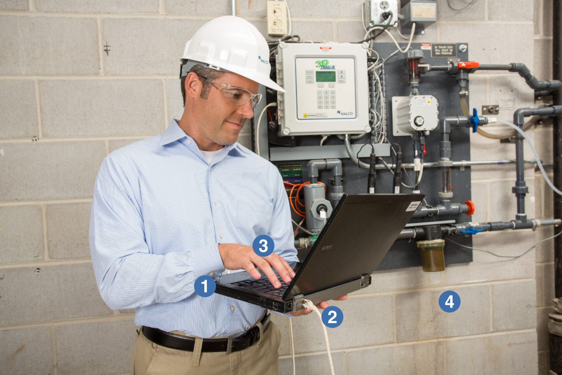
The image of a man working on his laptop represented what the current experience for an FT looked like as he conducted his visits. Some of the pain points that we highlighted were:
1. Using a laptop was not a portable solution
2. Recording and saving notes required network connection, which is sometimes not provided to the technician or not wireless
3. Mobile tasks such as taking pictures or getting customer signatures would require a separate device from their laptop
4. Difficulty switching between onsite locations and portable navigation services are unavailable.
DESIGNING THE SOLUTION
PROTOTYPE
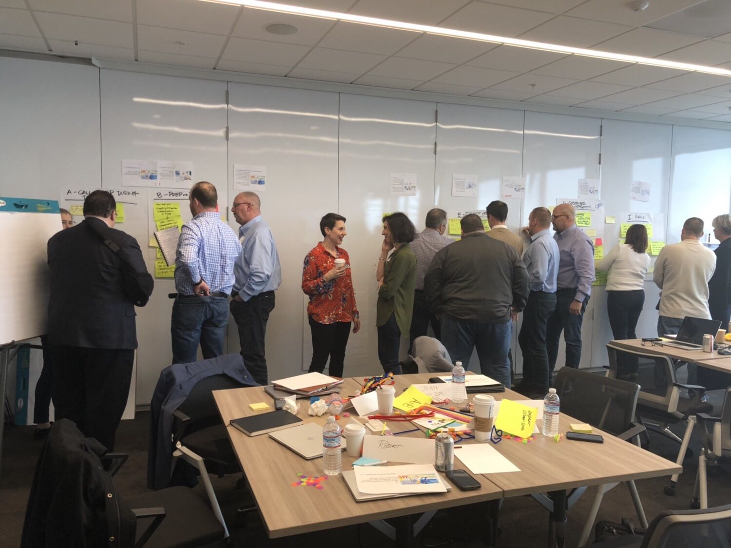
Stakeholder workshop with our team
I helped conduct interview sessions and a design thinking workshop with the stakeholders / FT's to plan and prioritize what should be built for initial launch. The plan was to completely redesign the experience, starting with a mobile first approach and replacing their web UI.
I used my findings to create personas and a user journey that walked through how an FT conducts his visits and communicates with his team. I also created user flows and sketched with the team on a design thinking session that allowed them to visualize what they wanted the app to look like rather than making changes to the current app. I would then design clickable prototypes and present during feedback sessions with all teams that would help refine the requirements that would later be turned into high-fidelity mockups.
MOBILE BREADCRUMB UI CASE STUDY
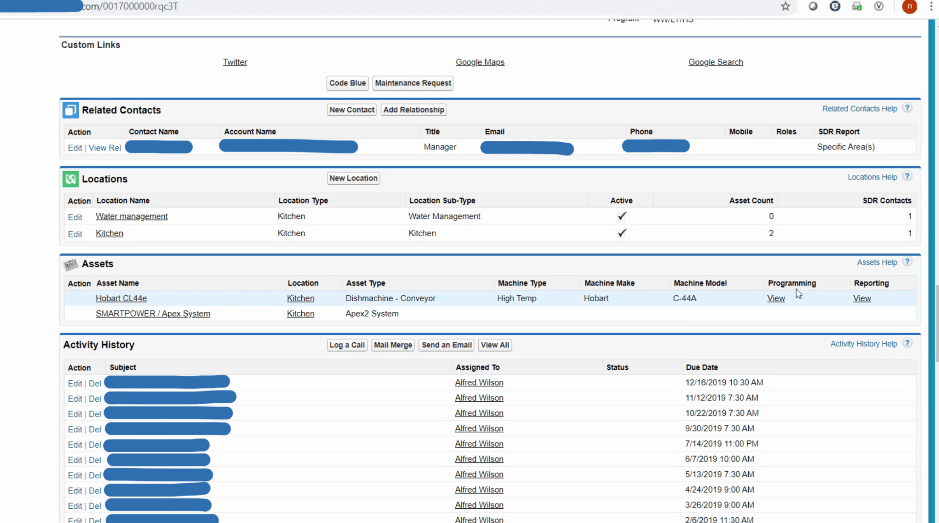
The client's current desktop design used breadcrumbs as their main navigation method since majority of the data being shown was in a hierarchy. Essential data was also becoming buried within long tables as all information was being shown to them, even if the data was outdated or not available.
I felt that using breadcrumbs on a mobile design was not the best solution for the amount of layers that the FT's had to drill down to, as it would often lead to confusion and a high bounce rate if they felt they were on the wrong page.
Preview of the desktop app
Another issue that came up was the usage of clicking vs. scrolling. Multiple clicks and long scrolls were thought of as the same thing, a time-consumer to get to the information they needed. I had explained the difference as each were used in different context. Clicking into a button or link is a decision based action while scrolling meant you were trying to find something in a similar list of information being shown.
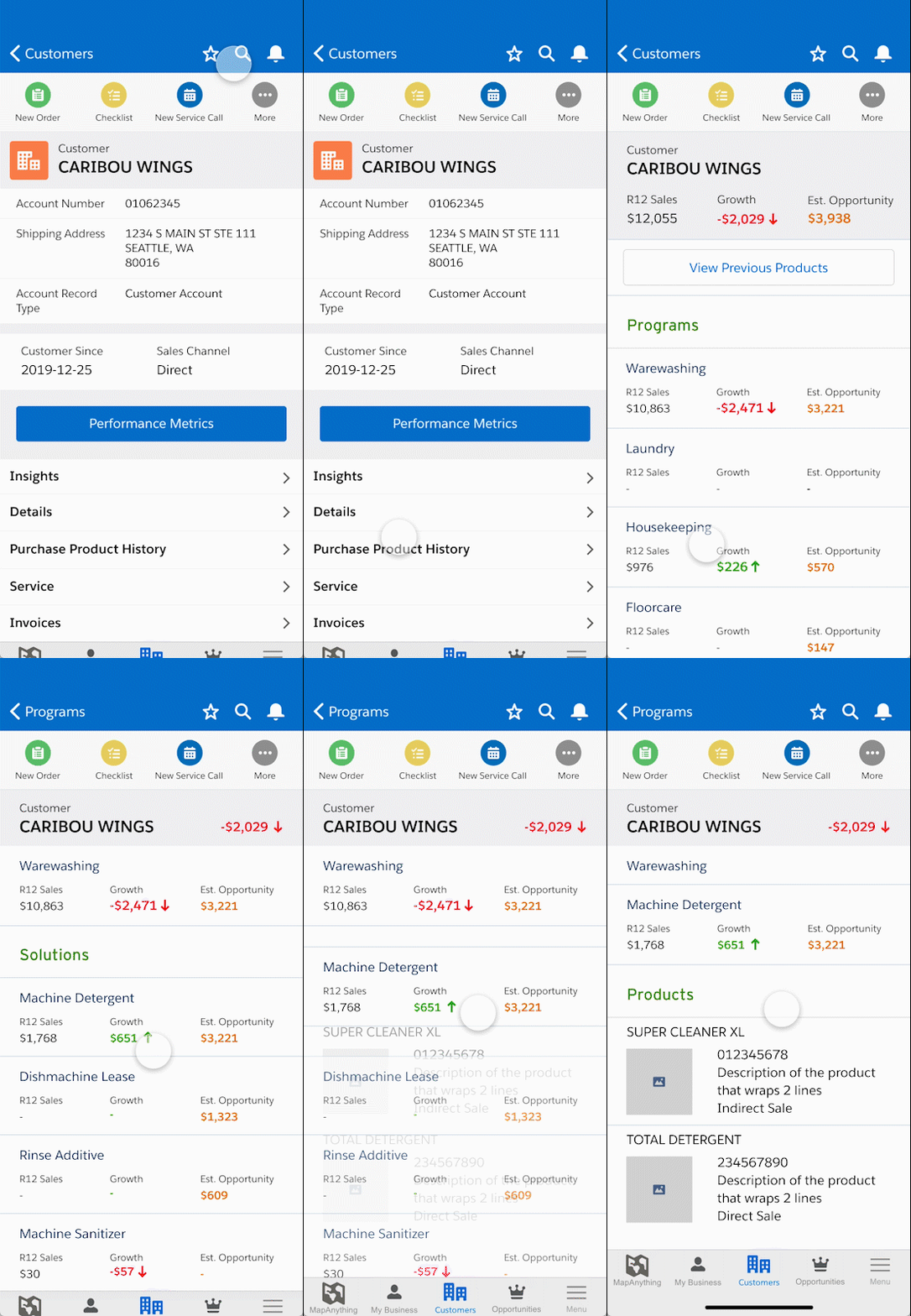
My solution was to create a mobile card UI that would allow the users to still have the same drill down navigation as their desktop solution, but also be able to easily navigate backwards if needed.
HOW TO IMPROVE
FINAL THOUGHTS
While designing, I had to keep in mind that I was introducing two new tools rather than one. One was the redesigned experience of their daily application that had a different way to navigate through information. The other was using a mobile device to conduct their tasks rather than on a desktop while on client sites. The FT's were used to seeing all of their content on one page and needing to scan through pages to find what they needed, so there would be a learning curve for the users to understand and change how they viewed information. I made sure to make navigating through each page easy to understand and prevent essential pages from getting buried.

